Pot Plant House Party - Time Machine (Single, 2021, Independent)
‘Time Machine’ is the follow-up single to ‘Late Night Science Fiction’ which was released earlier in 2021.
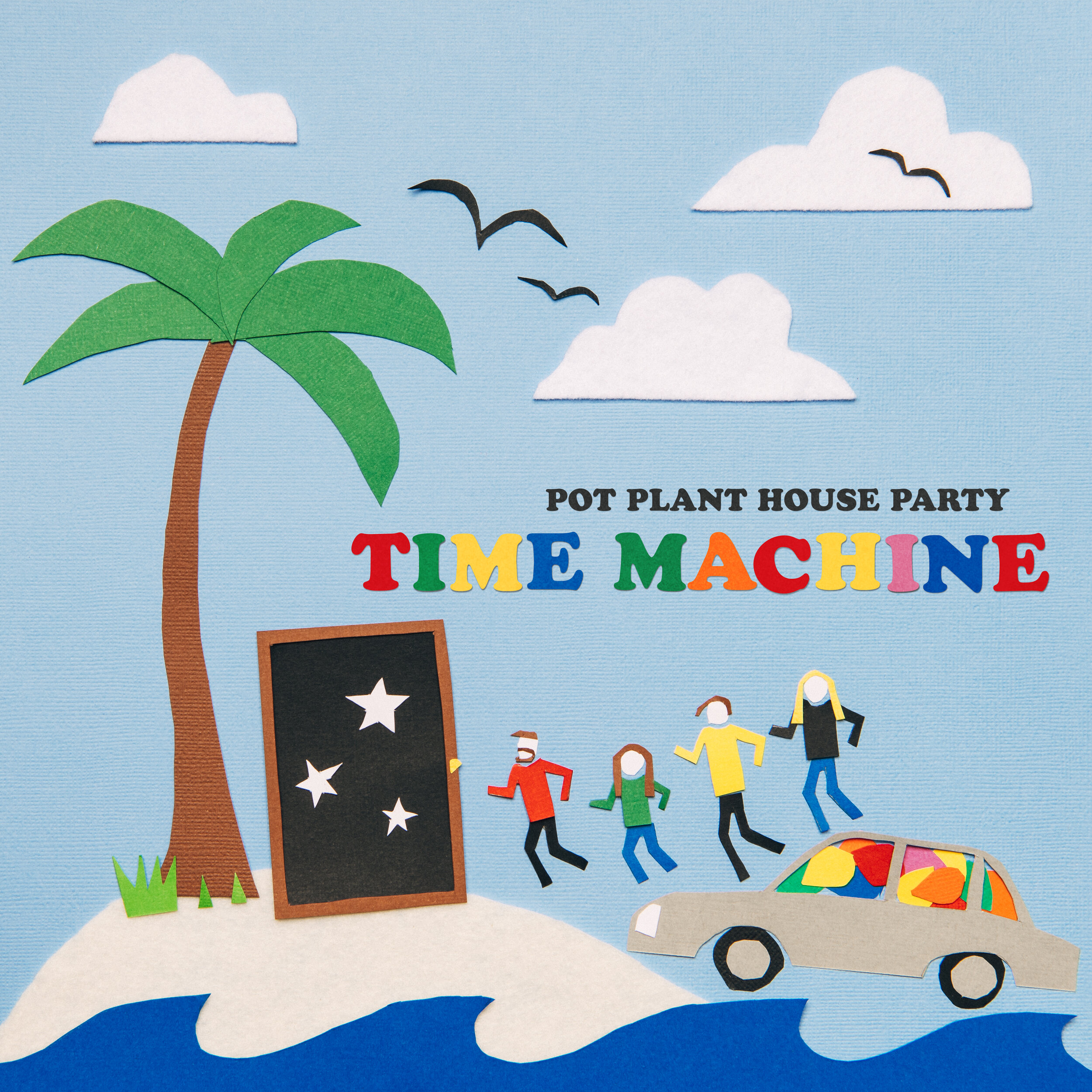
One of the important aspects of the creative collaboration with Pot Plant is building a visual identity with them that will both endure over a long period of time, but avoids becoming repetitive. After the cover work for the singles and EP ‘Sorry I Didn’t Call You Back’ in 2020, there was a desire to break the mould and de-template the designs. This cover is deliberately out of the box in order to allow us to move forwards in any visual style we feel works, in a bespoke way, as it disrupts any visual patterns we might have been falling into. It also affords us the luxury of real-time audience feedback on different ideas that will prove to be useful in future projects.
The original art direction for this cover was to recreate the island vibes of the back area of the Indi Bar in Scarborough, one of our favourite spots both socially and for shows. Except it would be made like a shoebox diorama, the kinds that were popular when I was a kid. Through the preproduction process, I realised that the eye level, on-a-table aspect to it would start to feel like retreading old ground. But the spirit of the idea was good; how could I do it as a flat-lay?
When I was at university, I made an entire magazine out of flat-lay items and articles and cut-and-paste collage spreads. Why not get in the Time Machine, pun intended, and go even further back? This is reflected in the lyrics too, a desire to return to a simpler time when we were kids, when the world felt less stressful and more fun. And so, we set out to create something from that early to mid 90’s period of time, but in a genuinely wholesome way.
It wasn’t until production day when I was starting to work on the boat they were meant to be climbing out of that I realized that the car with the balloons from Late Night could have been floating on water, not floating in the sky as a few people assumed it was. And from there, the idea that the covers are a narrative series came in; this cover truly was a runaway train of thought exercise of just letting myself play in real time. And so the doorway that was originally a phone booth (or, a Tardis, if you like) was developed as a deliberate narrative lead-in to whatever the next cover might be (I had already decided I wanted to go back in time even further into the 80s, but that’s a story for a future release)
It was also set for production the weekend of Anzac Day in April in Perth, which ended up also being another Covid Lockdown period, which ended up being the perfect time to spend hours meticulously playing arts and crafts in my apartment.
The artwork is a 300x300 card base, with a mixture of card and felt elements carefully arranged without any adhesive and then photographed. The issue with the adhesive would have been soaking or staining through the card, and we needed a variation/arrangement with and without text, so there was no way to commit anything to glue. Only the typography is digital, everything else is a single image with no compositing or retouching.
Shot on the Nikon D850 with an overhead 70x100 softbox and a bounce strobe to provide some additional fill to give it a nice even exposure for the blue base.
Cover image.
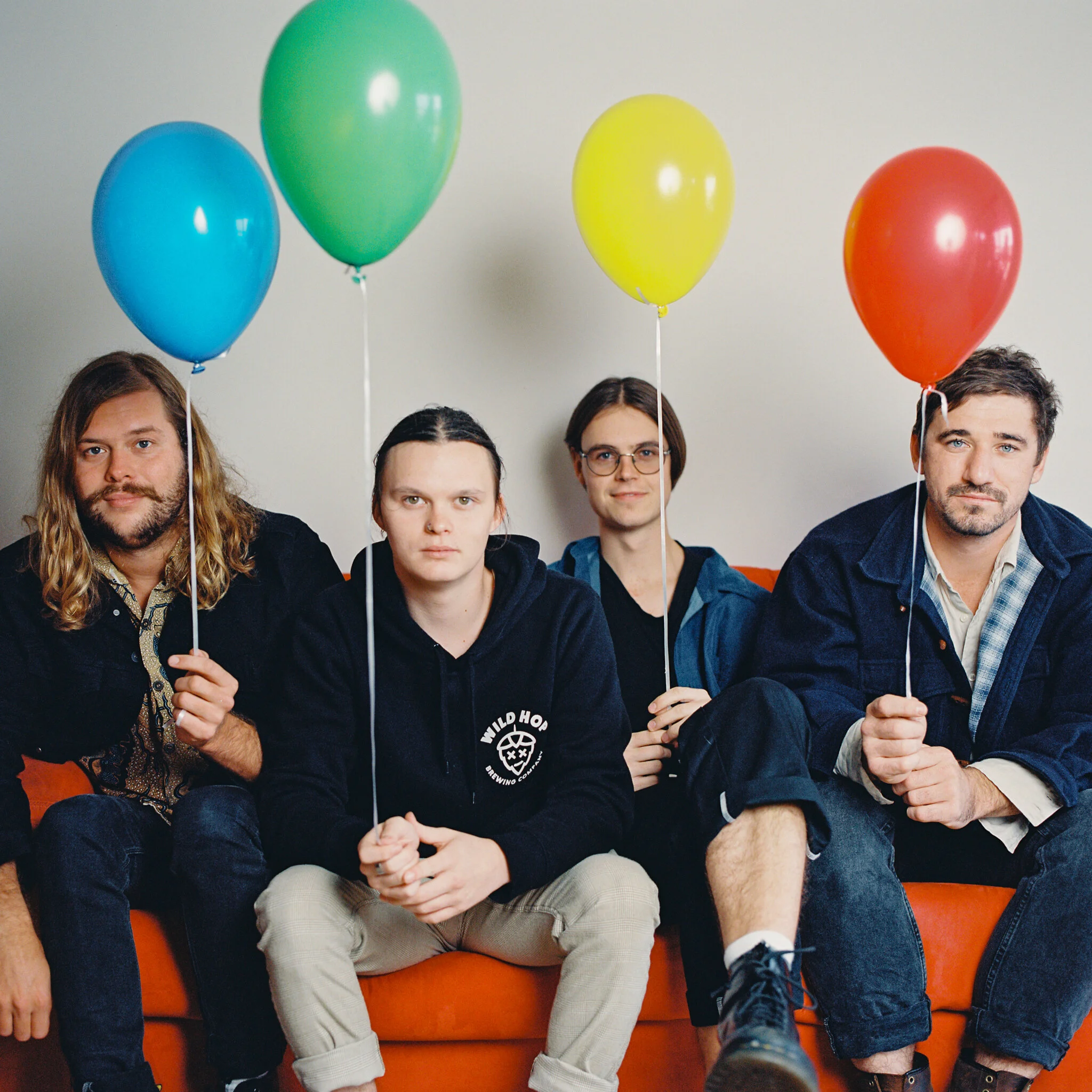
Press photos for the band were also made for this period of the release, utilizing the balloons as a prop as we hadn’t made any press photos since prior to Late Night being released, and it felt fitting to bring them back one last time before we move on to new ideas and aesthetics.
This series of press photos were shot exclusively on film, using the Hasselblad 500cm and the Leica, both on Kodak Portra 400. Developing and scanning by Silver Halide Studios. Lighting was a mixture of a Nanlite LED head with an umbrella, and ambient light.


